Whether your ecommerce company is just trying to keep things ticking along, or one of the lucky ones with increased demand, it can be hard to stay focused on your customers. In both cases, you’re much busier with day-to-day stuff, and handling more inquiries. You’re also trying to seize opportunities that will boost your business. Amidst all this, you don’t want to lose sight of what your customers actually need.
Ecommerce teams have to be adaptable at the best of times, but COVID-19 has introduced a whole new set of challenges. You’re probably getting more questions from your customers – and they're expecting faster responses. You might have more orders, but only a few team members on hand to fulfil them. You may also be rethinking your website's messaging so it's timely yet empathetic.
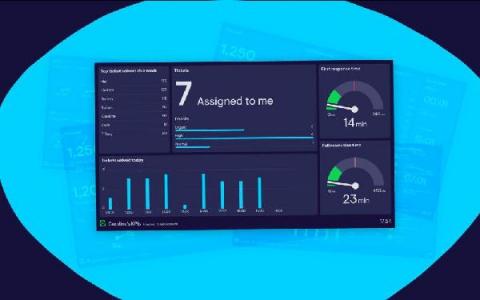
Dashboard design principles are all very well, but what do they look like in practice? This blog will walk you through nine golden rules, with a real-life dashboard example for each. By following these simple steps you can create a dashboard that's clear and effective. And you don't need to be a designer to make yours look great. Enjoy building!
You may have noticed that things are looking a little different around here, as we’ve made the biggest changes to our brand and product since we launched over a decade ago. Our old brand: There were several motivations behind the rebrand. Firstly, our visual identity was inconsistent. We’d last rebranded back in 2014, and since then our look and feel had moved on, but in an organic and un-codified way.
As your company grows, and departments become more specialized, teams can lose sight of overall performance. A dashboard is a great way to present the “pulse” of your business, and keep your team in the loop. Plus, it saves you from creating reports, which are often overlooked or out of date by the time people read them. But what aspects of company performance should you and your team be tracking?