Teams | Collaboration | Customer Service | Project Management

Latest News

How Geckoboard can help your team work better remotely

Geckoboard makes it easy to share your important metrics - whether your team are co-located or remotely distributed around the world. When you all share an office it's simple to put your dashboard up on a TV for everyone to see, but fostering that same culture of transparency and focus can be harder when you’re limited to communicating via Slack, email, and remote meetings.

4 ways to automagically import live data into spreadsheets

Importing live data into a Google Sheet or Excel spreadsheet might seem like a daunting task, but it’s easier than you think… If you’re reading this you probably know spreadsheets are a useful way to aggregate, tidy and analyse data. But what you probably don’t know is that with some simple techniques and plugins, any humble spreadsheet can be transformed into an incredibly powerful, automated, data-gathering machine that can save you or your team hours of manual input.

How to build data literacy in your business organization

A Censuswide study found that only 24% of decision-makers at surveyed organizations were confident in their data literacy. That means over 3/4 of respondents might be making business decisions based on potentially inaccurate data interpretation. Data literacy is the ability to accurately read, analyze, and apply data. It’s a crucial skill for team members of all levels.

How simplicity and focus has helped COBB Tuning maintain a CSAT score of 95% with 10,000 tickets per month

Continuing our series of Geckoboard customer interviews focused on KPIs, goal setting frameworks and dashboards, we speak to Matt Bryant, Customer Service Manager for COBB Tuning. Matt tells us how COBB Tuning maintains a consistently high CSAT score with a large volume of tickets and how their dashboards have kept the team pulling in the right direction throughout the Covid crisis.

5 sources of misleading statistics (and how they can jeopardize your company)

In 2007, toothpaste company Colgate ran an ad stating that 80% of dentists recommend their product. Based on the promotion, many shoppers assumed Colgate was the best choice for their dental health. But this wasn’t necessarily true. In reality, this is a famous example of misleading statistics. The ad suggested that dentists preferred Colgate over other toothpaste brands. But the survey asked them to list several brands of toothpaste they would recommend.

A 5-minute guide to KPI reports (plus tips to build your own)

You spent the whole quarter collecting data about your new website design. You tracked a ton of KPIs, from traffic fluctuations to bounce rates. It's time to show your manager the success of your redesign. How do you do that? With KPI reports. A great KPI report doesn’t just showcase the data you collected; it also presents an argument for the next steps your organization should take.

How Geckoboard dashboards help India's largest online furniture rental company deliver incredible customer service

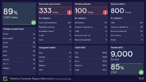
Continuing our series of Geckoboard customer interviews focused on KPIs, goal setting frameworks and dashboards, we speak to Sandeep Jindal, Head of Customer Support at Furlenco. In this post we cover how India’s largest online furniture rental company uses Geckoboard dashboards to monitor their most important Customer Support metrics, what they did to increase CSAT from 75% to 85%, how they’ve been impacted by Covid and much more.

How to build high performance teams without micromanagement

When you’re responsible for a team’s performance, you might feel the itch to micromanage. You might be thinking, if you don’t watch employees’ every move and assign all tasks, how will the group stay on track? But micromanaging stifles the creativity and collaboration that drives high performance teams. Multiple studies have shown that micromanaged employees are less creative, produce lower-quality work, and are less engaged overall.

How Five Doors Network Real Estate use dashboards to stay on top

In the first in a series of Geckoboard customer interviews focused on KPIs, goal setting frameworks and dashboards, we speak to Michelle Jaeger (Operations) from Five Doors Network. We’ll cover how Five Doors uses the Keller Williams Four Conversations method to build a highly successful real estate team and how their dashboards allow them to monitor their most important metrics.

6 Data visualization techniques to display your key metrics

Think of a set of data visualizations like the dashboard in your car. When you look at them, it should be easy-to-absorb information at a glance—your speed, fuel amount, and so on. Likewise, data visualization techniques help your teammates and managers grasp the significance of the metrics in seconds. Speed isn’t the only advantage of data visualizations. A report found that people were, on average, 89% better at problem-solving when they looked at data represented visually.